NOURISH APP | CASE STUDY
A supportive health tracking app to help you learn about your wellbeing and create a healthy lifestyle.
OVERVIEW
ROLES
User Researcher, UX/UI Designer, Information Architect, Branding, Visual Design
TOOLS
Figma, Illustrator
DURATION
7 months
RESULTS
Survey, personas, competitive analysis, user flows, sitemap, style guide, lo-fi wireframes-hi-fi wireframes, usability testing, clickable prototype

ABOUT
A wellness and education resource app. The purpose of this app is to assist you in learning about what you are eating and help you improve your well being.
PROBLEM
How might we develop ways to take meaningful action to help people understand the importance of eating whole foods?
SOLUTION
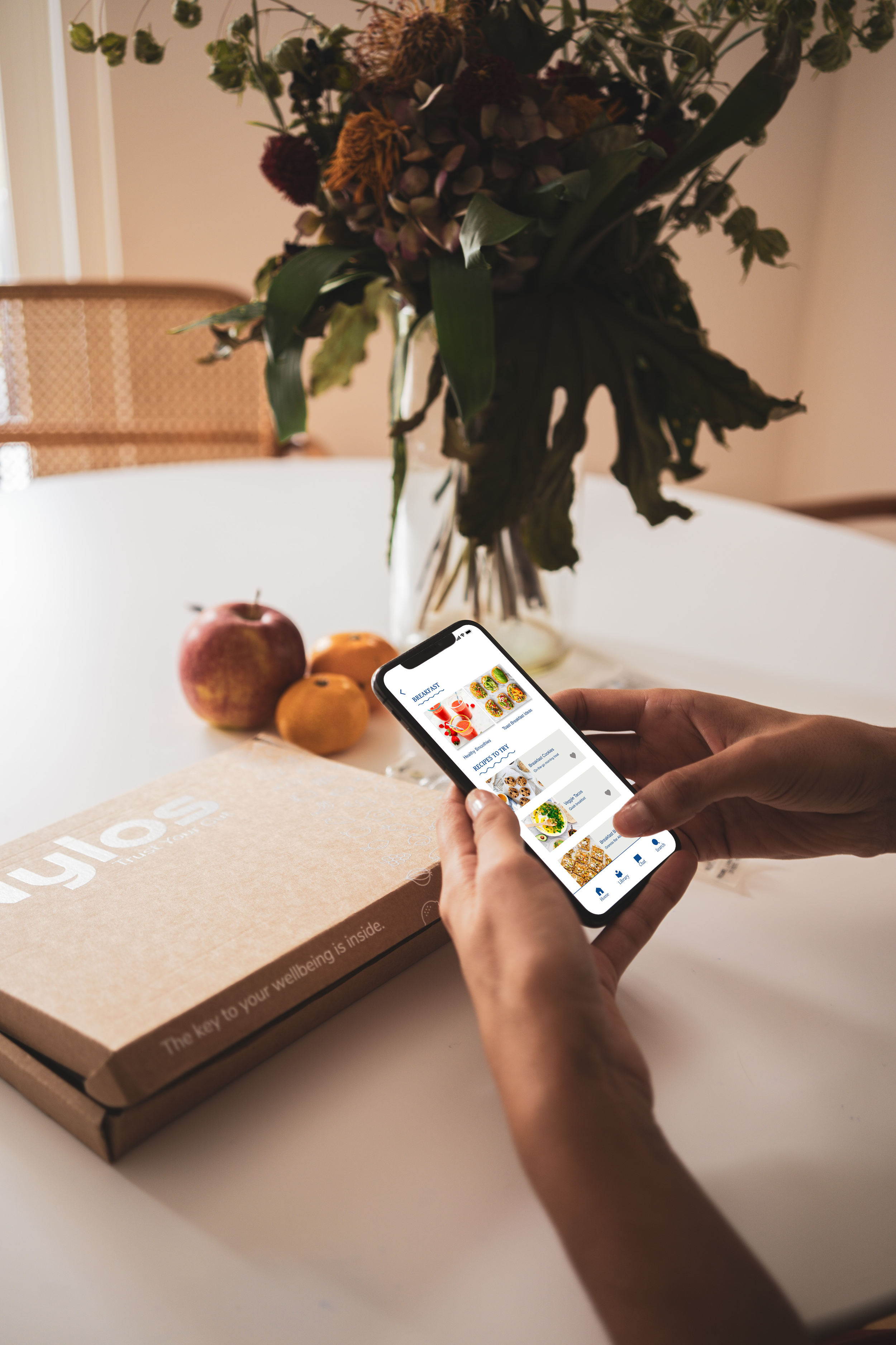
The vision for the Nourish App is to redefine how you view health. It is a wellness and education resource app. The purpose of this app is to assist you in learning about what you are eating and to help you improve your overall well being and the well being of others.
THE THEMES
INSIGHT
Participants desire to improve their eating habits for health reasons or appearance.
Participants lack health education, time and motivation.
Participants can experience pressure or negative emotions when it comes to eating healthy.
COMPETITIVE ANALYSIS
There are many applications that aim to help users track their food and exercise. There are less applications that aim to improve your overall well being.
Noom teaches users to shift their mindset and approach on weight loss by focusing on long-term health, physical activity and good nutrition.
My fitness pal is a smartphone app and website that tracks diet and exercise using gamification elements to encourage adherence to exercise and diet goals.
Weight Watchers is a points system weight loss program that provide Individualized plans based on lifestyle and food preferences, food tracking and community support.
RESEARCH & DISCOVERY
INTERVIEWS & PERSONAS
From holding in-depth interviews, we identified two user personas: health enthusiast and busy working professional. Both user groups held time and health of high importance. Their main motivations differed in energy levels: health enthusiasts needed intuitive health tracking options while busy working professionals needed health education.
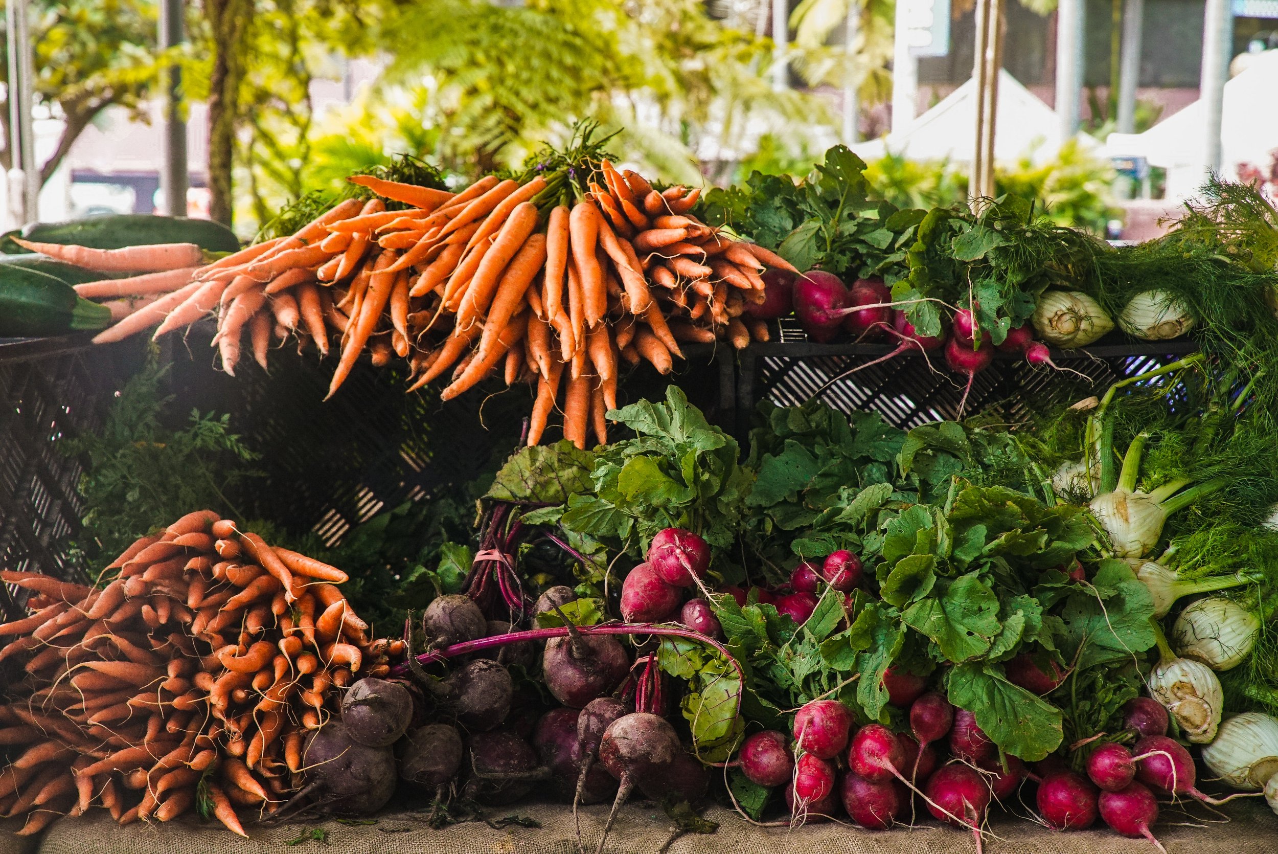
The health enthusiasts who are interested in improving their overall health but are put off by traditional calorie tracking apps. They are users that try to shop at natural grocery stores and farmers markets.
The busy working professionals that want to be healthy. Although they have minimal time for learning, exercising and cooking.
INFORMATION ARCHITECTURE
SITEMAP
The sitemap below shows the hierarchical and navigational structure of the app.

USER FLOWS
Based on the client brief and the user research performed so far, I created a list of user flows. Putting myself in each persona’s shoes, I narrowed it down to five user flows that encompassed the heart of Nourish.
On boarding
Logging food
Logging your mood/feelings
How to get involved/volunteer
How to listen to an audiobook
*See below for an example of the logging your mood/feelings flow.

PROTOTYPES & TESTING
LO-FI WIREFRAMES
After user interviews and research I started developing ideas in sketch to help me figure out how I wanted to lay out my ideas and then I moved on to creating some low fidelity wireframes with some features and general layout ideas for my health app. After that my team and I did concept testing with users to see what they liked about the app and what features they think should be added or taken away.
TAKEAWAYS
Some key takeaways were that they enjoyed the following:
Easy food recording options of writing, taking a photo, scanning the food or dictating what you ate.
Enjoyed the recipe recommendations.
Liked the meal replacement suggestions.
Users wanted more educational aspects.
Users wanted the app to focus more on mental health and well being not calorie counting.
USABILITY TESTING
I focused on 4 different tasks to the right of different usability testing I felt would be some of the most important features of the app. I wanted to test the products functions, features and purpose to see if they align with how people will use the product.
Learn:
Users were able to perform the tasks but had some difficulty with how to navigate there.
Results:
Improve on the navigation, wording and further develop search and calendar icons.
MID FIDELITY WIREFRAMES
From there I moved on to creating mid-fidelity wireframes where I used my user feedback to help further develop how the user would interact with the app and what features they are needing. Some key features are logging health along with mood and implementing a daily feed of educational content.
IMPACT
“Users were curious on how does the app define health?
“I hope it defines health as matter of fact not labeling food good or bad.”
“It is a self-learning app for learning, leisure and how to be healthy.”
LEARNED
Icons, arrows and implied swiping is intuitive
People want direction on what is next and if they completed a task
Wording is important when navigating
To add more information on volunteer opportunities, books, podcasts, etc.
NEXT STEPS
Fix prototyping issues
Create next steps and more exiting out popups for users
Continue to add in more information and details
Develop chat feature
Further develop how you would log your food, mood, and activities and how to app would help educate you.
BRAND IDENTITY
MOODBOARD
To start to create a brand identity, I created two mood boards to show different themes for the app. One was meant to engage the user with a friendly illustrative mood that promotes positive mental health. The other mood board was meant to be fresh and give the user a sense of optimism, clean and promote the health living.
The theme I chose was the illustrative one to create a friendly and fun experience for the user. I used primary colors and secondary colors to accent. Developed illustrations to show mood and actions surrounding health and education.
TONE OF VOICE
Engaging
Our users depend on us to provide an engaging interface that appeals to our user needs.
Positive
This application is used for health, journaling, volunteering, exercising and tracking. We think it’s important that we provide a positive platform for an individual’s mental and physical health.
Mental Health
Nourish is designed to be health focused to add to our user’s overall well being.
BRAND DESIGN
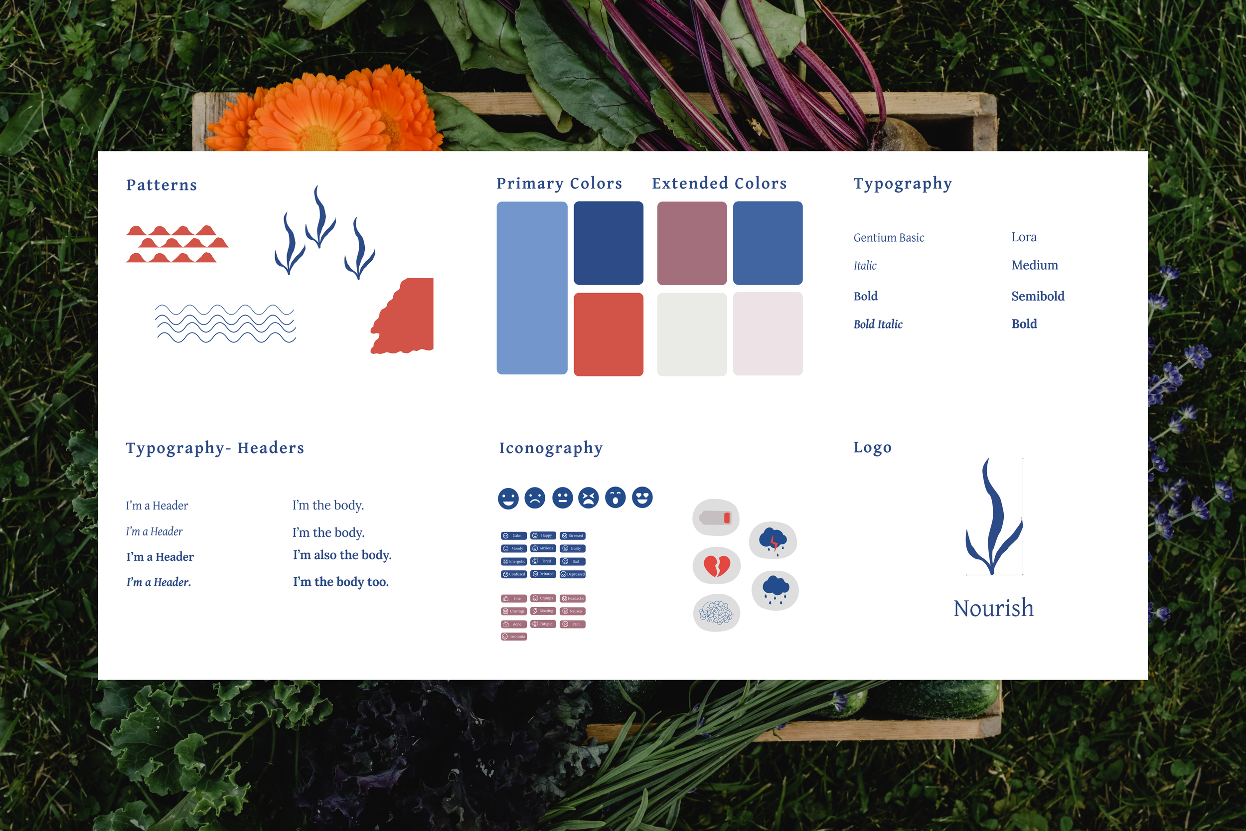
After creating the mood. I started to develop the style guide. I found two Serif fonts I felt spoke to the brand and were complimentary to one another. I am using Gentium basic for the headers and Lora for the body text. I then created iconography that I felt helped portray mood, feelings and patterns that accented the theme.
HI-FI PROTOTYPE & TESTING
In this stage, I integrated color, branding, images and icons to give the Nourish app its personality. I implemented the user feedback from the mid-fid prototypes. Specifically, I developed an AI chat feature that would help provide intuitive support to the users. I also added more popups and steps throughout the app to guide the user.
SUMMARY & LEARNING MOMENTS
How was the problem solved?
Focused on a well being service for individuals
Presented only necessary features
Used AI to help make the user feel heard and learn
Implemented education and feelings
TAKEAWAYS
In the future, I would spend more time ensuring my low-fidelity wireframes were testing seamlessly before jumping into the next phase of adding detail and color. This means more testing earlier in the process and more iterations to optimize functionality in the low-fidelity stage.

